Welcome to Roots Analytics, where data science meets innovation.
- 1 - Subjected data to multiple statistical analysis tools:
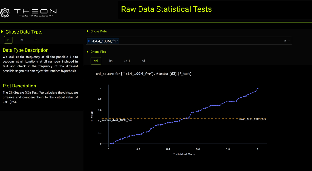
- a- Chi square (CS) test
- b- Kolmogorov-Smirnov (KS) test
- c- Anderson-Darling (AD) test
- 2- Statistical tests were written in Python from basic principles.
- 3- Ran tests on multiple configurations of the data:
- a- Investigated frequency of all connected pairs of 8-bit segments (e.g., a 64-bit number has 7 pairs of 8-bit segments).
- b- Two methods used:
-
- Look at all test pairs together to check general distribution.
-
- Split pairs based on the first segment and analyze each separately to check for conditional probability.
- 4- Data was collected from the random number generator, cleaned, and organized into ordered Excel sheets with specific names and hierarchies.
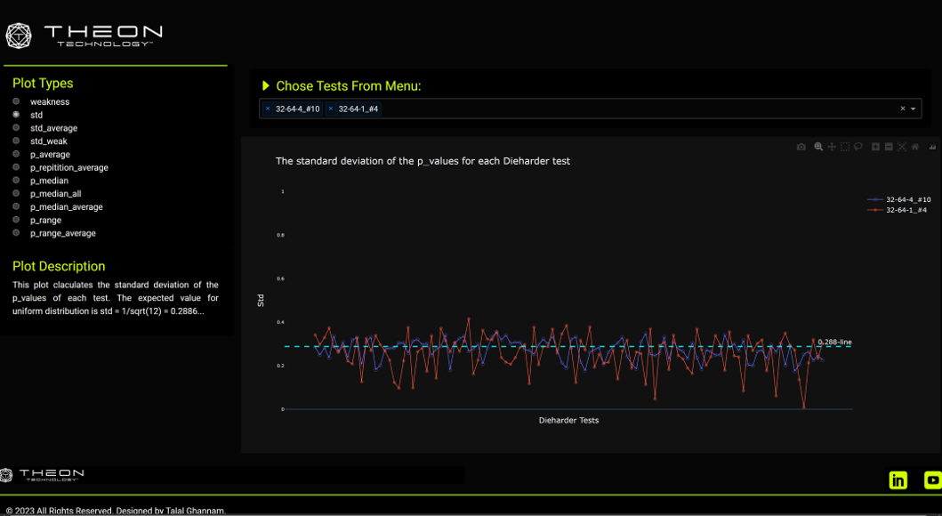
- 5- Results were illustrated using various plots and presented through a professional BI dashboard.
- 6- Dashboard created using the Plotly Dash library and deployed online via the Heroku platform.


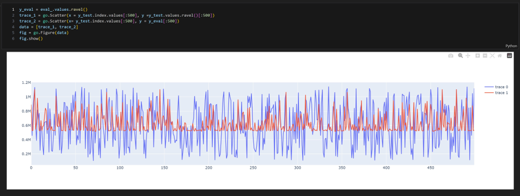
Problem involved using supervised machine learning (shallow and deep) to predict the distance of the next or previous perfect square number to a specified number x.
- Data provided consisted of a table with numbers from 1 to 100,000, along with:
- 1- Their next and previous square numbers
- 2- Other mathematical functions like digital root and polarity of the numbers
- Supervised machine learning was implemented using two approaches:
- 1- Shallow learning:
- Several estimators were used, including XGBoost, which provided the best results.
- 2- Deep learning:
- Pytorch library was used for the deep learning approach.
- Results: XGBoost showed more promising results compared to the Pytorch deep learning approach.
Achieved a non-trivial accuracy with XGBoost.

- Search is based on specific criteria, such as a shared element (e.g., Mona Lisa) between the links.
- The code explores links of links based on the same criteria, up to a user-defined depth of search.
- Extracted names from the links are returned in a nodes list CSV file.
- Another code checks whether entities share links with others to create edges between entities.
- An adjacency matrix of zeros and ones is created to represent relationships between nodes.
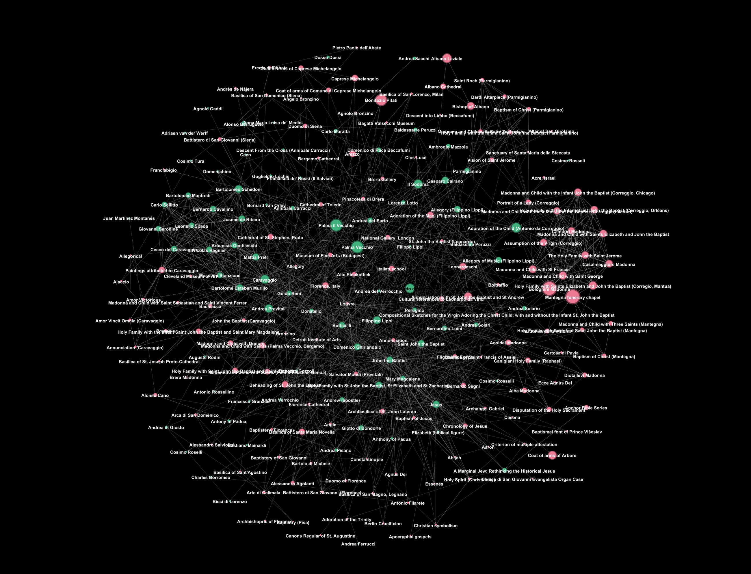
- A graph (G) is created using the nodes and edges.
- A separate code determines whether each entity is a person or non-person by searching Wikidata.com and checking for a ‘date of birth’ through web scraping.
- If a birth date is found, the entity is labeled as a person, and this attribute (along with date of birth) is added to the node.
- In both cases (person or not), information about the entity is added as a node attribute.
- The graph is plotted using the Plotly Dash Cytoscape library and the Gephi program.
- Centrality measurements are applied to assess the network and identify the most influential node.
- A geographical distribution of the entities is plotted to visualize the nationalities of persons involved in the network.

[Project 3: Creating a Dashboard for a Bycicle Company (captsotne project]
